Label specific points in graphs
Don’t alternate ticks in graphs with panels
Change layout of panels/graphs
Include details as footnote for all graphs
Change colors and symbols for different groups in the data

In this post I’ll show you 5 great Minitab graphs tricks. Please download the Minitab file with the data sets so you can follow along.
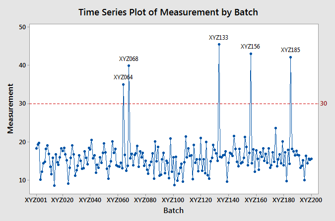
When you create a time series plot with lots of data points, there’s no way of having a tick mark in the X-axis for each of the points. In such cases, you might want to identify specific points in the graph. For example, let’s say that you want to identify the points above 30 in the following time series plot. 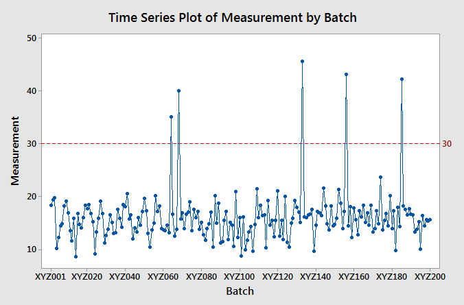 Unfortunately, there’s no straightforward way of assigning labels to specific points in a plot. However, you can create a column with the labels and then assign the labels of the points according to the new column:
1) Create the labels column using the calculator. To create the labels Go to Calc – Calculator and use the IF function: IF(<condition to label>, <column with labels>, “”). For the example above, go to Calc – Calculator, then enter a name for the labels column, and create the IF formula. 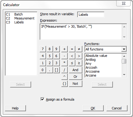 2) Add the labels to the points using the labels column. Right-click any of the points, go to Add -> Data Labels
 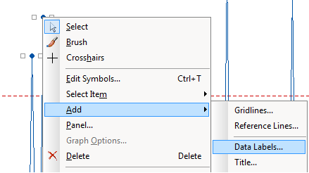 3) Then select Use labels from column, in the text box enter the column with the labels and then press OK.
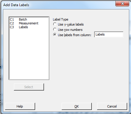
After these steps you’ll end with a graph like this:
Two important notes about this tip:
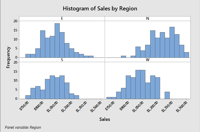
When you create a plot with panels in Minitab, the default setting is to alternate the ticks between the panels as in the figure below. 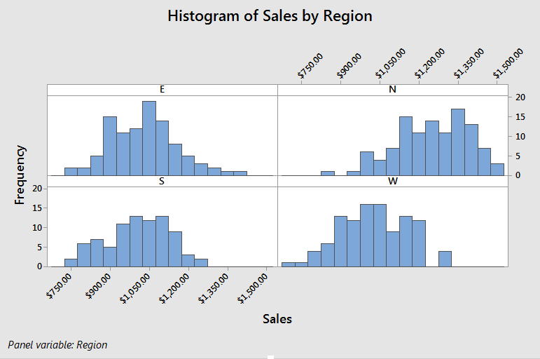 My personal reference is to have the ticks for the X-axis at the bottom and the ticks for the Y-axis at the left, as shown below. If you have the same preference as me, you can go to: Tools – Options, once there go to Graphics – Panels – Options, then select ‘Don’t alternate panels’.
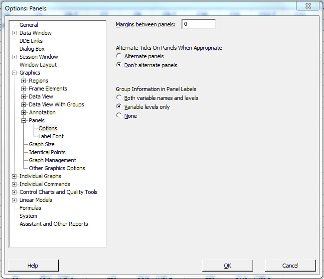
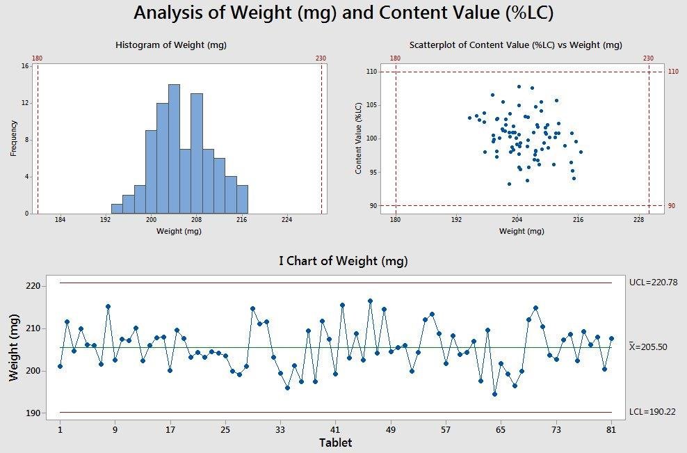
When you create a graph with panels in Minitab, the graph will be created with a predefined layout of panels. You can change the layout of the panels by double click on any of the panel labels, Go to Arrangement, click on Custom, change the number of rows and columns, and click OK. 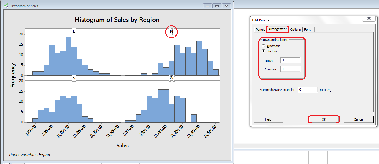 The result for the previous example (4 rows x 1 column) looks like this:
 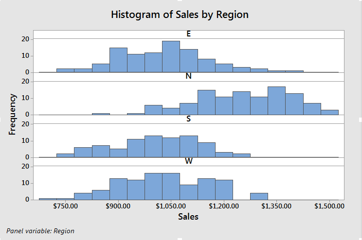 Another scenario you might encounter is that you have different graphs and you want to put them all together. For example, let’s say you have the following graphs created separately and you want to put them on a single graph with multiple panels.
 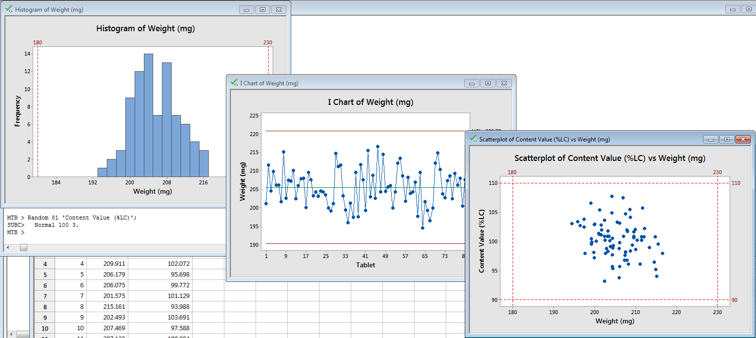 To put them all together, go to Editor – Layout Tool, then add the graphs in the locations you want. Once there, you can change the number of rows and columns as in the graph below.
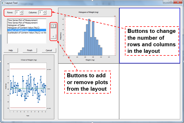 After entering the three graphs, the result would be as follows
  If you want to, you can change the size of the graphs by click on the any of them and dragging the extension points (circled in green below) in the direction you want:
 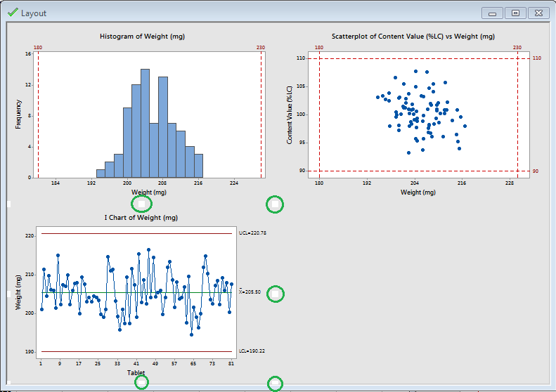 For example, after dragging the middle-right point in the previous graph the result would be as follows:
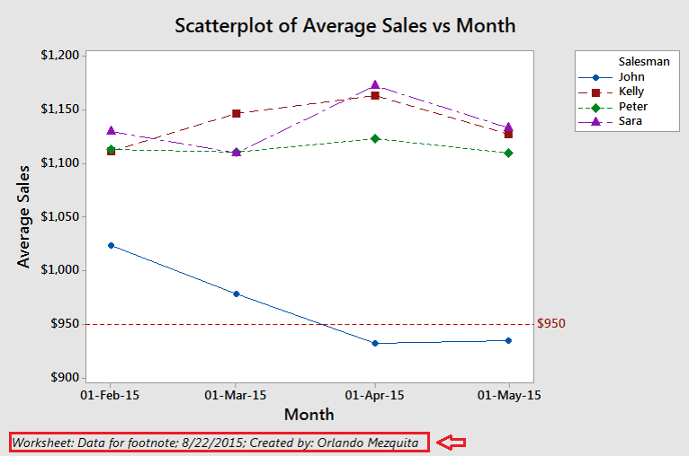
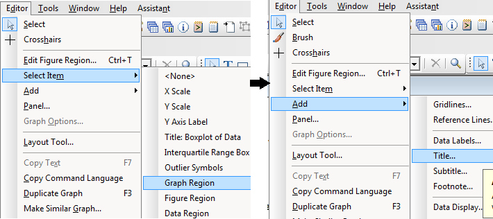
Notice that I added a title for the whole graph, for doing this go to Editor – Select Item – Graph Region; then go to Editor – Add – Title.
Let’s say that you want to include a footnote in all graphs with the worksheet name, date of last modification, and a custom text (for example: Created by Orlando Mezquita). You can easily do this by going to Tools – Options; once there go to Graphics – Annotation – My Footnote and select the options you want: 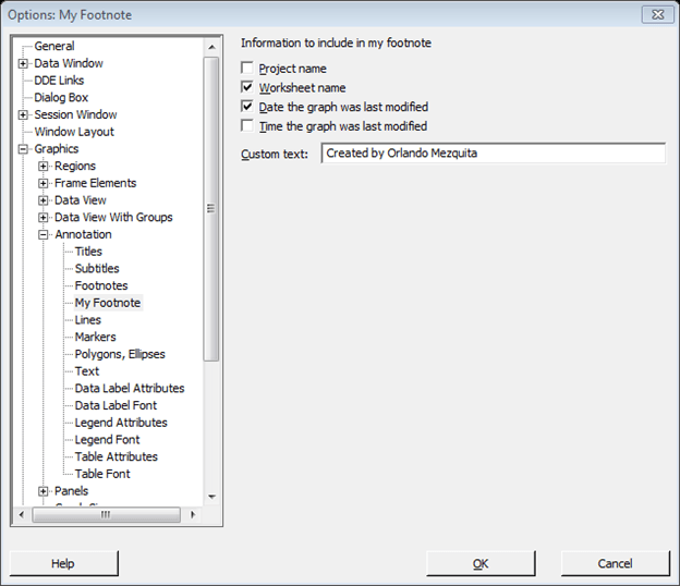
After you change these options all the graphs created will have a footnote like this:

Sometimes you want to change the colors of points/symbols/boxes in a plot based on different groups. Let’s say that you’re under the following scenario: You are monitoring a process where you take samples three times per run (Beginning, Middle, and End). Each run could be executed by a different person (equipment operator). If you create a boxplot by sample it would look like this:
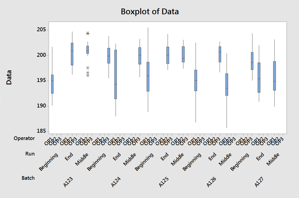
Oops! There are two issues we must solve before going on…
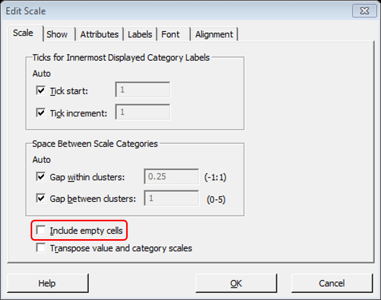
First, all operators (OP1, OP2, OP3) are included for each run even if there’s no data. To solve this, double-click over the operators labels to open the Edit Scale dialog box, once there, click the Scale tab and uncheck the checkbox Include empty cells.
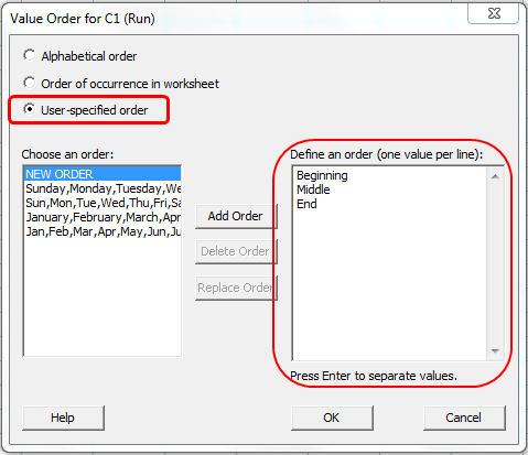
Second, the labels for the run are not ordered corrected. As you can see in the graph, the current order is alphabetical (Beginning, End, and Middle) but the right order should be Beginning, Middle, and End. To solve this:
After doing this and refreshing the graph (Right-click in the top-left corner of the graph and select Update graph) this is what we get:
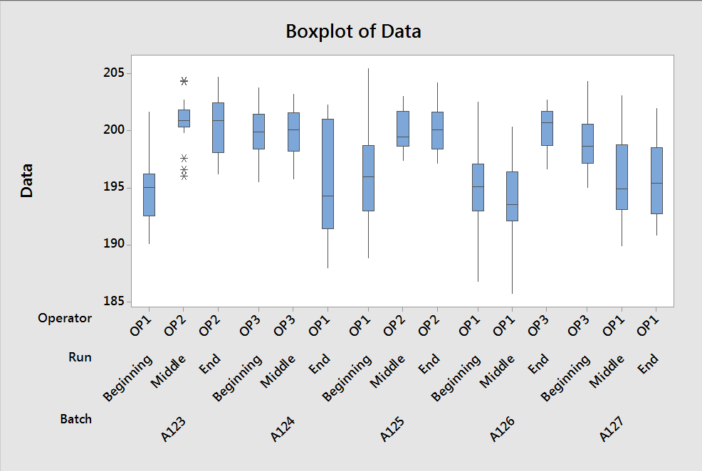
Ok, now we can continue,… As you can see in the boxplot, there are some runs that show a greater variability. If we change the color of the boxes based on the operator it should be easier to see if there’s an association between the operator and the variability observed.
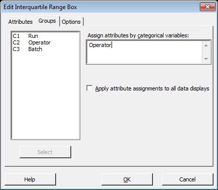
To do this right-click on any of the boxes, select Edit Interquartile Range Box, go to Groups and select the Operator as a grouping variable.
Notice that you can do this with other type of graphs, for example, in the case of a time series plot you can right-click any of the points and change the grouping accordingly.
Do you have any Minitab graph trick? Please share it in the comments section!