One of the most useful charts in Minitab is the Individual Values Plot since it allows you to see the distributions of the samples. You can also observe the general profile of the data if you add the mean values for each of the samples.
To illustrate the use of individual value plots we will work in the following scenario:
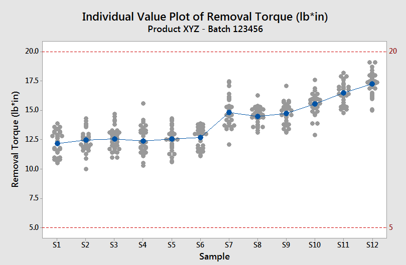
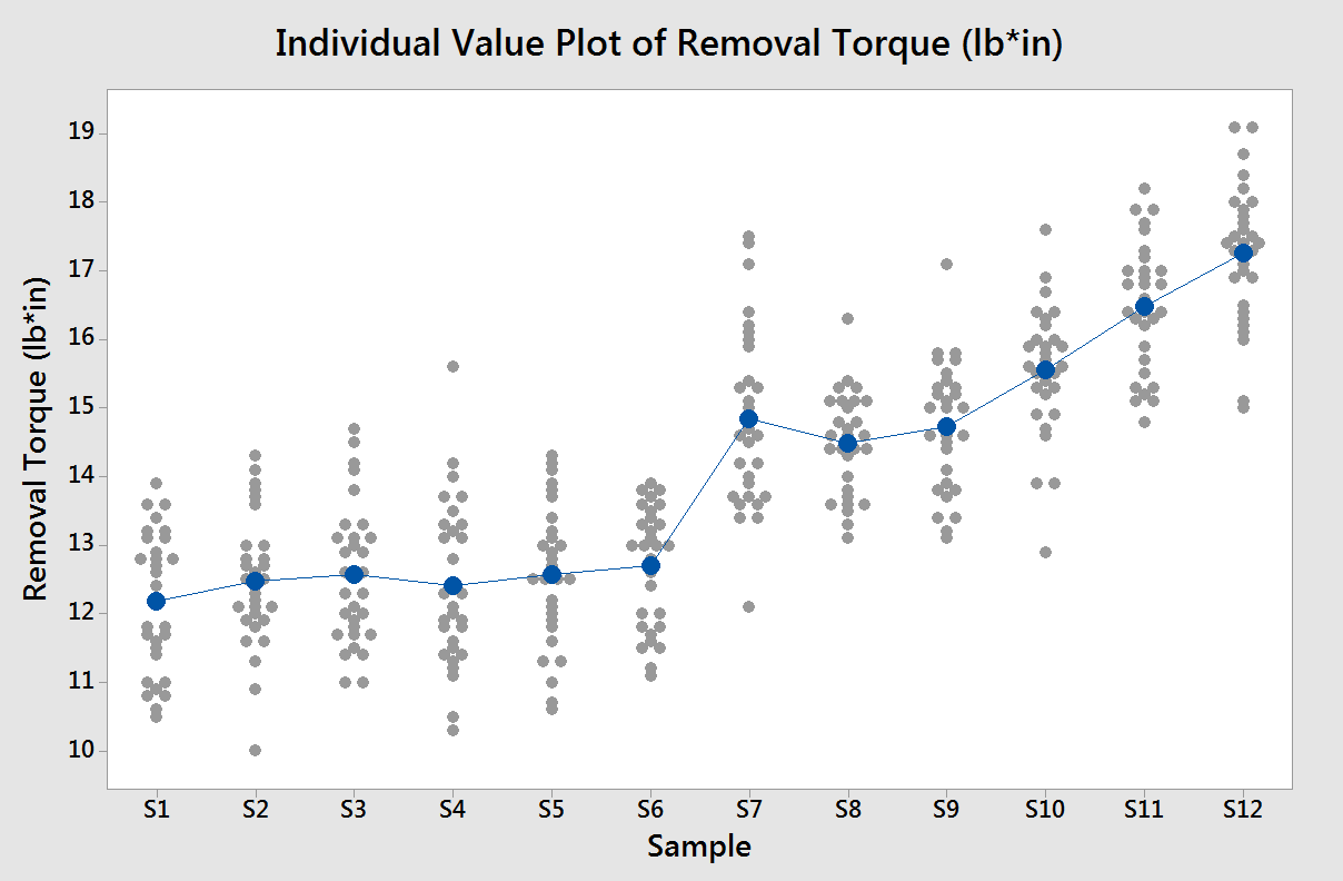
Imaging a packaging process where caps are screwed to bottles. During the packaging of each batch you take 12 samples of 20 bottles and measure a variable called removal torque (“force” to remove the cap) for each bottle. To analyze these data you could create an individual value plot with the means per group.
In this mini-tutorial I’ll show you how to create a graph like the one below:
How to create the individual values plot
To create the individual values plot per group:
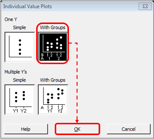
- Go to Graphs → Individual Values Plot…
- Then select on One Y With Groups and click OK
- Fill in the variables for graph variables (Y-axis) and Categorical variables (X-axis) and click OK. In this case, the Graph variable is Removal Torque and the categorical variable (Group) is Sample.

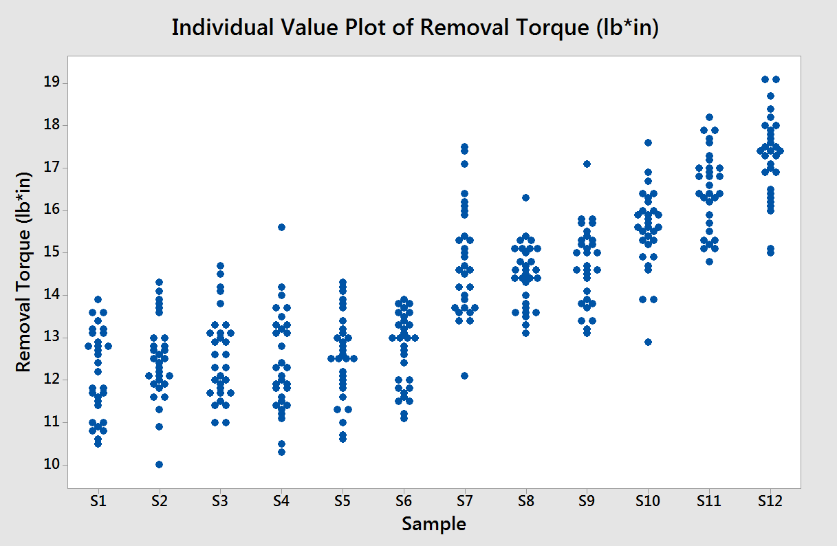
The result should look like this:
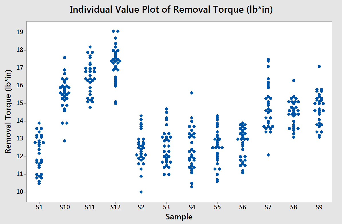
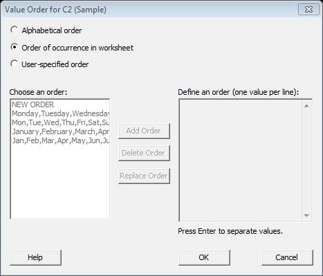
From the above graph you will notice that sample S1 through S12 are not in ascending order as S10, S11 and S12 precede sample S2. This can be corrected by changing the value order or the Sample column.
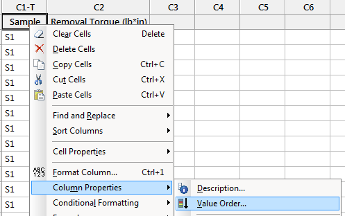
To change the value order right click on the sample column and select Column Properties →Value Order.
2) Select the desired order.
In this case the values were entered in the right order so we can choose the option ‘Order of occurrence in worksheet’. However, you can also specify the order manually by selection the option ‘User-specified order’.
The result will be like in the graph below, as you can see, the X-axis has the right order now.
Plotting the mean per group
What if you want to see the general profile of your data? A possible way of doing this is by adding the mean of each group to your plot.
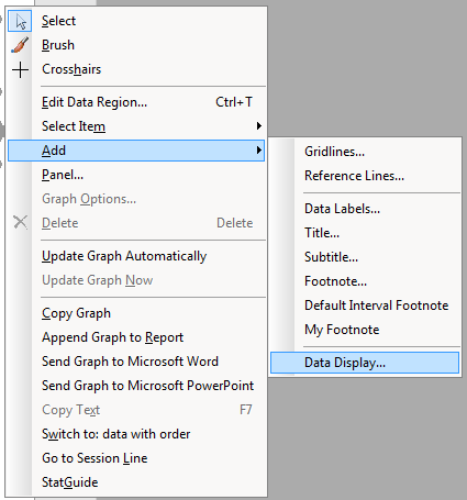
To add the means per group and a connect line between the means: right click on the graph and select Add → Data display as shown below
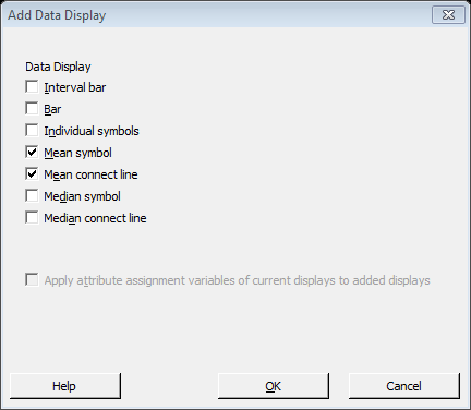
Then check the checkboxes for ‘Mean symbol’ and ‘Mean connect line’:
The result should look like the graph below:
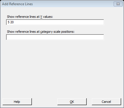
Graph data in the context of specifications and add subtitle
As you may know, the scale used on plots can totally change how the reader draws conclusions from plots. Therefore, if you are plotting a variable with specifications a good practice is to include reference lines with them.
To add reference lines to a plot, right click any part of the plot, select Add → reference line. Enter the values for the reference lines separated by space.
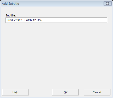
Also, you can add a subtitle to include any additional details to ease the interpretation of the graph. For example, we could include a subtitle to indicate the product and batch number that is being plotted.
To add a subtitle, right click anywhere in the plot, select Add → Subtitle. Then type the subtitle as shown below:
The final result should look like this:
Subscribe to the website to be notified when new mini-tutorials become available.