A common myth I hear very frequently is that you can’t work with more than 1 million records in Excel. Actually, the right myth should be that you can’t use more than 1,048,576 rows, since this is the number of rows on each sheet; but even this one is false.
In this post I’ll debunk this myth by creating a PivotTable from 50 million records in Excel.
To make things more interesting, I’ll import data from 20 different text files (.csv) with 2.5 million records each.
To accomplish this, I’ll use two Excel tools: Power Pivot and Power Query. Power Query is also known as ‘Get and Transform’ in Excel 2016.
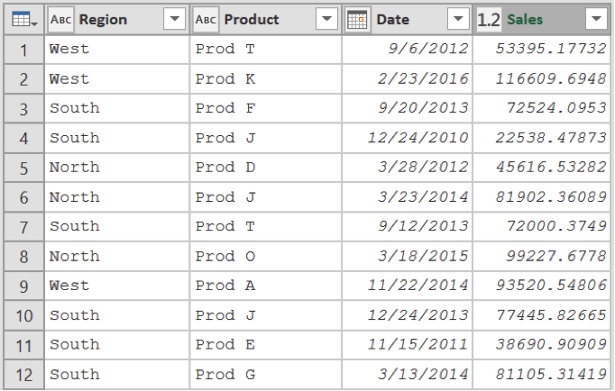
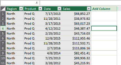
For this post I’ll be using sales records with the following fields: Region, Product, Date, and Sales. The desired goal is to be able to analyze the sales performance by year and region.
If you want to follow along, please download the files from this link.
If you don’t have Power Query on your computer, you can download it from here: Power Query Download.
The process I’ll follow is:
Data import and cleaning
As mentioned before, the data are contained in 20 text files. Therefore, the first step is to import and append the information from these files.
Note: I’ll use Excel 2016, however, the steps are the same on previous Excel versions. If you have Excel 2010/2013, go to the Power Query tab instead of the Data tab.
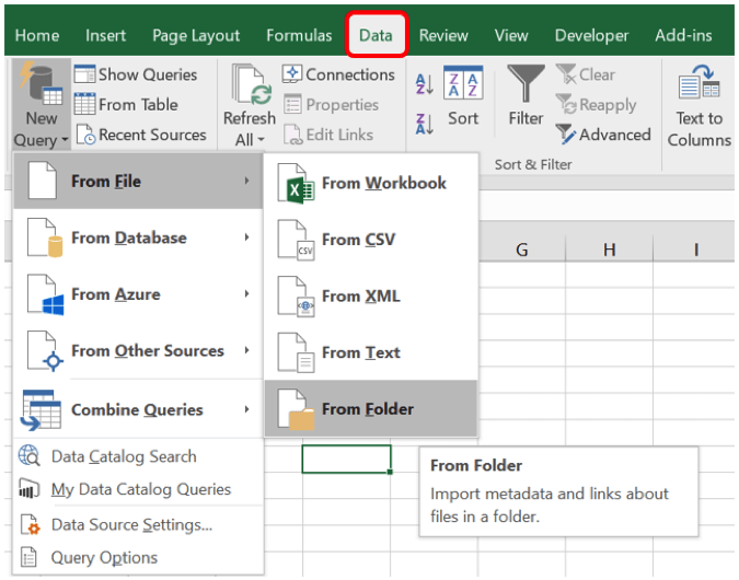
Step 1: Import the data into Excel using Power Query.
Go to Data New Query From File From Folder
Click on ‘Browse’ and browse for the folder that contains the files, then click OK.
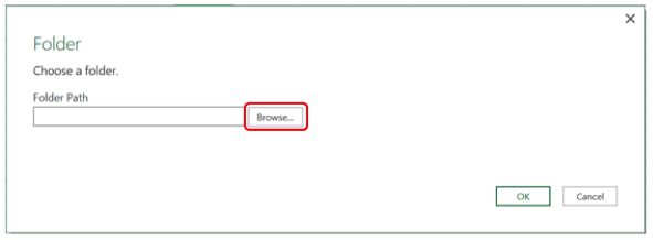
Another option (the one I generally use), is to copy the path of the folder and paste it on the folder path box.
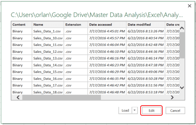
Once you click OK, press Edit on the next window.
Then expand the content by clicking on the double arrow button
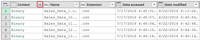
Once the data is imported it will look like this:
Step 2: Remove the headers from each file
The files will be imported with headers, so you must remove them. For this you can go to any of the columns and remove the column name from the options. For example, go to the ‘Region’ column and setup a filter to exclude the word ‘Region’.

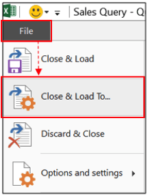
Step 3: Load the data into the Power Pivot Data Model.
After removing the headers, you just need to load the data into the Power Pivot Data Model. To do this go to File Close & Load To…
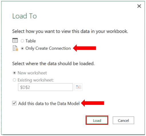
On the ‘Load To’ dialog box, select ‘Only Create Connection’, then click on the checkbox ‘Add this data to the Data Model’ and click on Load.
After you click Load, you’ll be able to use the data within Power Pivot.
Modify the Power Pivot Data Model
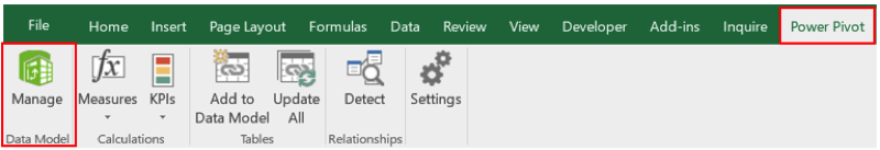
To make modifications to the Data Model, such as adding other columns, you can open the Power Pivot window.
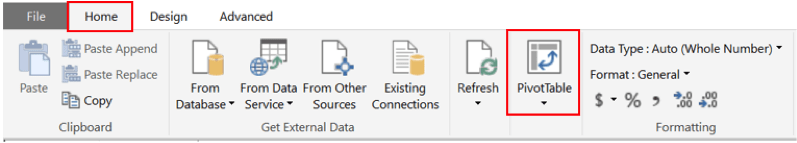
To Open Power Pivot, go to the Power Pivot tab and click on Manage.
If the Power Pivot tab is not visible follow the instructions on this link to enable it.
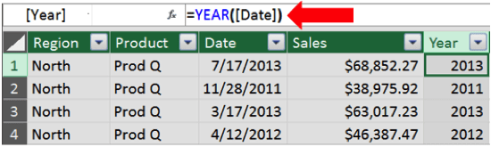
For this example, I’ll add a column called Year to calculate the year of the date column. To add a column, go to the rightmost column and double-click the header, then type the desired name.
Then on the first row of the new column type the formula ‘=YEAR([Date])’ and press enter. The years will be calculated after pressing Enter.
Important: Another way of adding the Year column is to do it in Power Query. In this way, you don’t have to open the Power Pivot window to modify the Data Model since the Year would already be part of the source data.
Creating the PivotTable
Once the Data Model is ready, you can create the PivotTable by clicking on the PivotTable button on the Home Tab of the Power Pivot Window.
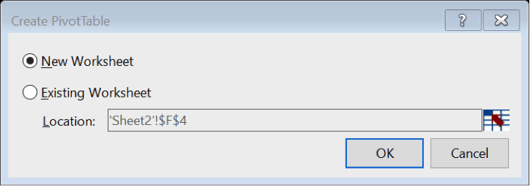
Then select the location of the PivotTable (New worksheet or Existing worksheet) and click OK.
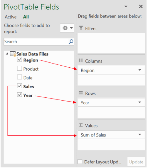
Once you click OK, the PivotTable Fields List will appear. In this example, drag the Region field to the Columns Area, the Year field to the Rows area, and the Sales field to the Values area.
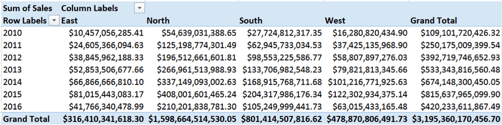
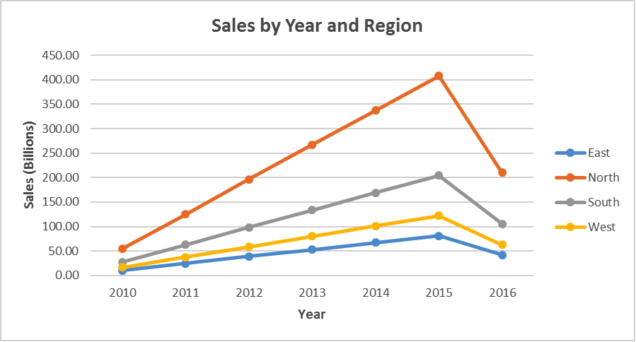
After these steps, you should get the following PivotTable with the Sales by Region and Year from 50 MILLION records.
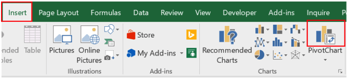
You can take this even further and create PivotChart from the existing PivotTable.
Click on any cell of within the PivotTable and go to Insert PivotChart.
Then go to Line Line with Markers
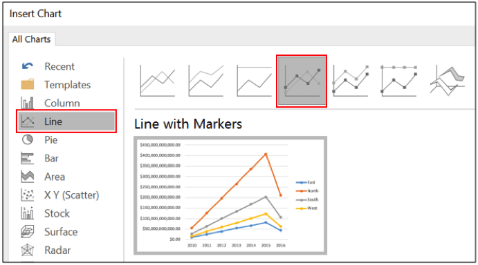
You should get a chart like this (After a few formatting tweaks, such as adding Axis Labels, Title, …)
Finally, you can add visual filters (Slicers and timelines). Slicers allow you to filter by categorical fields; timelines allow you to filter dates.
Add a Slicer
To add a Slicer for the PivotChart, select the PivotChart and in the Analyze tab click on ‘Insert Slicer’.
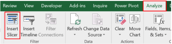
Select the field to be filtered (e.g. Region) and click ‘OK’.
Add a timeline
To add a Timeline for the PivotChart, select the PivotChart and in the Analyze tab click on ‘Insert Timeline’.
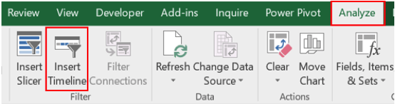
Select the date field to be filtered (e.g. Date) and click ‘OK’.
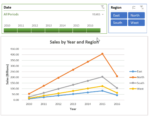
Voila!
The end result should be a dynamic chart with filtering capabilities as shown below. Again, you’re dynamically visualizing millions of records.
You can download the final file from this link.
Please share this post with other people so they can benefit as well.
If you want to get notified when new posts become available. Subscribe for free to Master Data Analysis!!