In this post I’ll show you 5 great Minitab graphs tricks. Please download the Minitab file with the data sets so you can follow along.
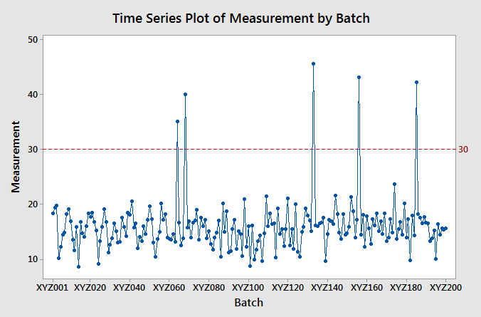
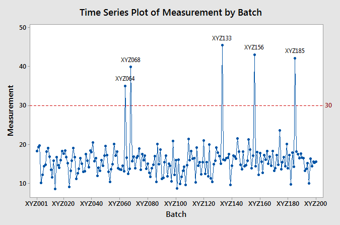
When you create a time series plot with lots of data points, there’s no way of having a tick mark in the X-axis for each of the points. In such cases, you might want to identify specific points in the graph. For example, let’s say that you want to identify the points above 30 in the following time series plot.
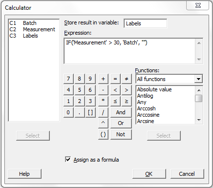
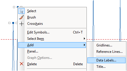
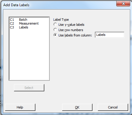
1) Create the labels column using the calculator. To create the labels Go to Calc – Calculator and use the IF function: IF(<condition to label>, <column with labels>, “”). For the example above, go to Calc – Calculator, then enter a name for the labels column, and create the IF formula.
After these steps you’ll end with a graph like this:
Two important notes about this tip:
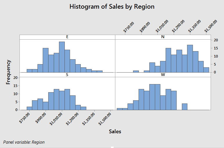
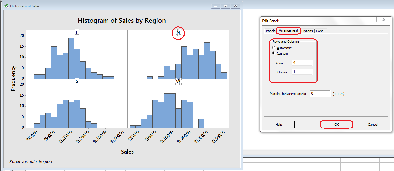
When you create a plot with panels in Minitab, the default setting is to alternate the ticks between the panels as in the figure below.
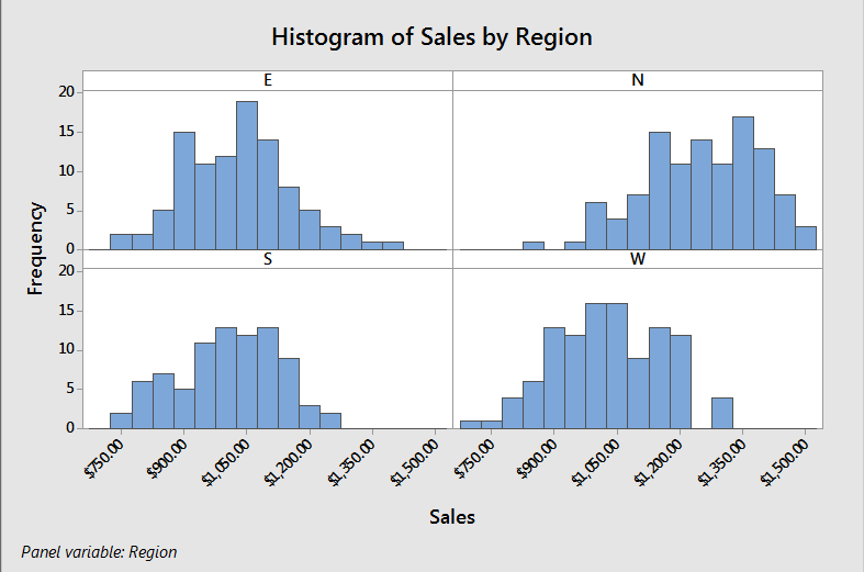
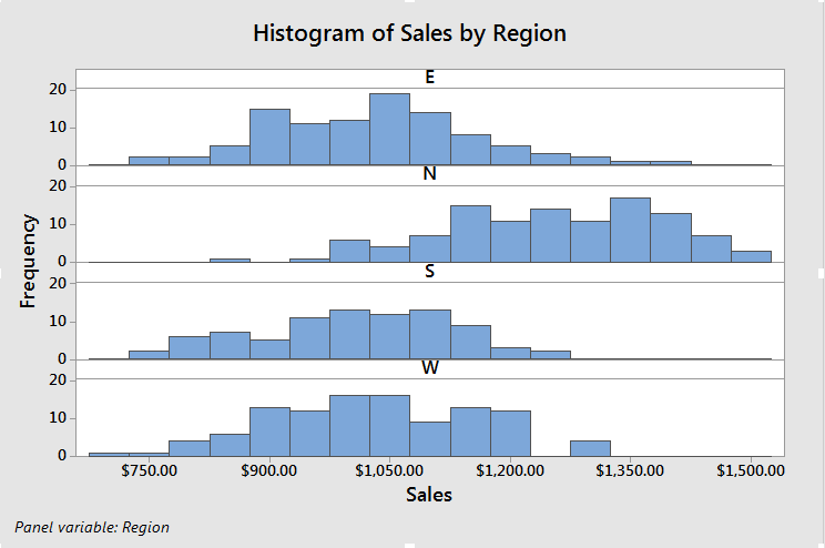
When you create a graph with panels in Minitab, the graph will be created with a predefined layout of panels. You can change the layout of the panels by double click on any of the panel labels, Go to Arrangement, click on Custom, change the number of rows and columns, and click OK.
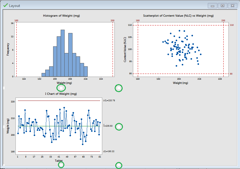
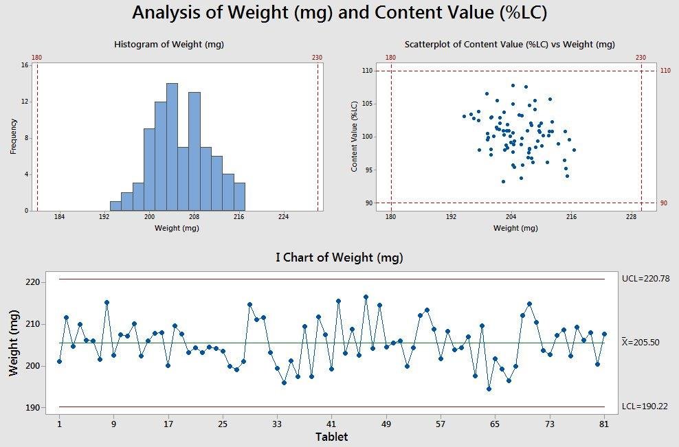
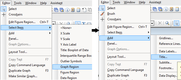
Notice that I added a title for the whole graph, for doing this go to Editor – Select Item – Graph Region; then go to Editor – Add – Title.
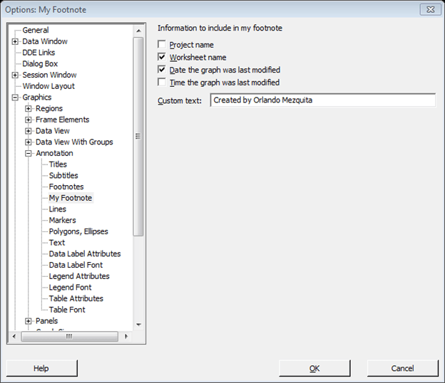
Let’s say that you want to include a footnote in all graphs with the worksheet name, date of last modification, and a custom text (for example: Created by Orlando Mezquita). You can easily do this by going to Tools – Options; once there go to Graphics – Annotation – My Footnote and select the options you want:
After you change these options all the graphs created will have a footnote like this:
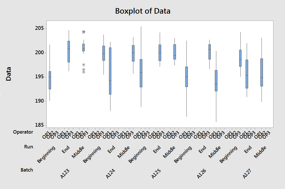
Sometimes you want to change the colors of points/symbols/boxes in a plot based on different groups. Let’s say that you’re under the following scenario: You are monitoring a process where you take samples three times per run (Beginning, Middle, and End). Each run could be executed by a different person (equipment operator). If you create a boxplot by sample it would look like this:
Oops! There are two issues we must solve before going on…
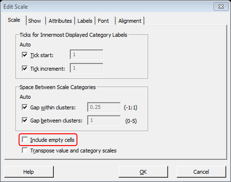
First, all operators (OP1, OP2, OP3) are included for each run even if there’s no data. To solve this, double-click over the operators labels to open the Edit Scale dialog box, once there, click the Scale tab and uncheck the checkbox Include empty cells.
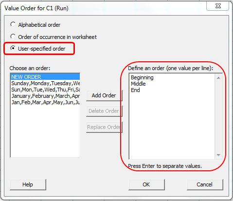
Second, the labels for the run are not ordered corrected. As you can see in the graph, the current order is alphabetical (Beginning, End, and Middle) but the right order should be Beginning, Middle, and End. To solve this:
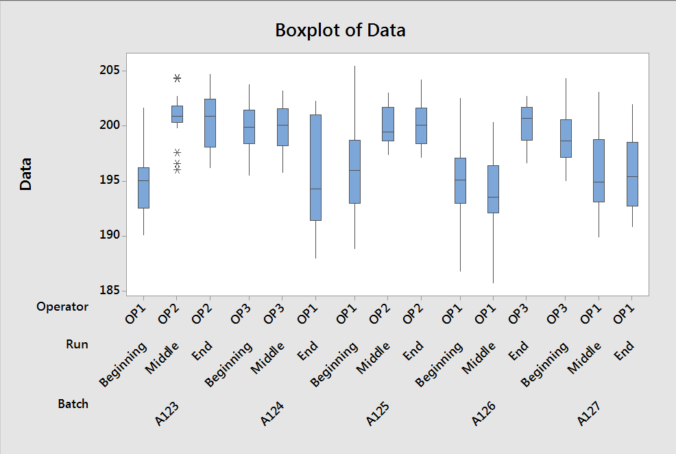
After doing this and refreshing the graph (Right-click in the top-left corner of the graph and select Update graph) this is what we get:
Ok, now we can continue,… As you can see in the boxplot, there are some runs that show a greater variability. If we change the color of the boxes based on the operator it should be easier to see if there’s an association between the operator and the variability observed.
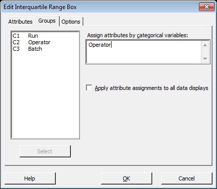
To do this right-click on any of the boxes, select Edit Interquartile Range Box, go to Groups and select the Operator as a grouping variable.
Notice that you can do this with other type of graphs, for example, in the case of a time series plot you can right-click any of the points and change the grouping accordingly.
Do you have any Minitab graph trick? Please share it in the comments section!
Do you want to learn or get better at R programming? If yes, you will…
Go to Master Data Analysis Yes, you read the title of this post correctly, you…
In this post, I’ll show how to create a simple model to predict if a…
Are you wondering what's all this buzz about data science? The following videos will give…
Go to Master Data Analysis This is the 4th post of a series that covers…
Go to Master Data Analysis This is the 5th post of a series that covers…
View Comments
Thanks!
Very useful tips, Orlando. Thanks for sharing / posting.
I know of an alternate, possibly a simpler way, to insert labels for select data items ( your tip#1).
When you are in the select graph, click on the graph region, you will see the button "T" ( text) in the Graph Annotation Tools bar. Click the button T, you will get a text box, type the label you want to see within the text box, move it to the relevant data point and leave it there. The label is pinned there.
This way you don't need calculations or formulas and since this is highly random, one can insert the desired label in any order to nay data point.
Hi Ondiappan,
Thanks a lot for proposing this alternative.
I would suggest the use of both alternatives depending on the scenario:
* If there are only a few points to label ( 5), then you can use the automatic method as suggested in the post.
Excelente Orlando (Saludos BTW)!
Bien útil, Muchas gracias!!! J. Pina
Gracias a ti por visitar la página!
Te puedes suscribir de forma gratuita y los posts nuevos te llegarán directamente al email.
Orlando, excelente nobhe podido parar aprendiendo unos gráficos que no tenía idea; esto está a otro nivel.
Felicidades y muchas gracias por esta página.
Gracias Levis!
Me alegra que te gustara.
Orlando, I just tried adding data labels to a control chart. I followed the steps you outlined above. However, when I right-click on any data label and click Add..., there is no option for me to add Data Labels. In other words, my dropdown box includes Gridlines, Reference Lines, Title, Subtitle, Footnote, and Default Title. Data Labels is not an option in my list. Can you please help?
Hi Tom,
Thanks for your question. You're right. The data label option is only available for time series plot. I'll correct the title and text of that section of the post accordingly.
What you can do if you still want to label the points is to first create the control chart to see what are the control limits. Then create a time series plot of the data and add the control limits as reference lines (Add -> Reference lines). In this way, you'll have both the control limits and the labels for the points outside of the control limits.
Sorry for the inconvenience.
Could we add separate reference lines for each panel
Hi Mala Kalra,
No, unfortunately, there's no way to do this at the moment.
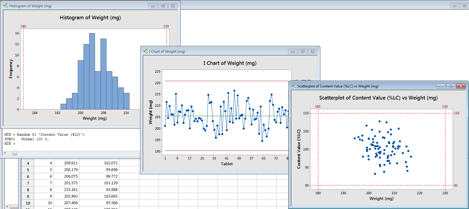
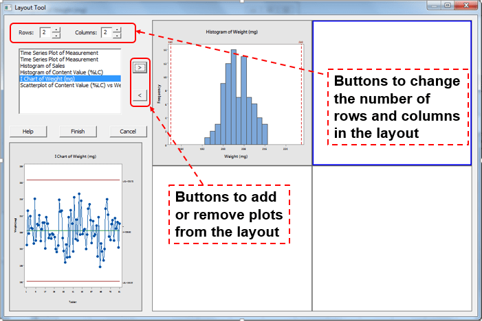
The only possible workaround I could think of, is creating the graph separately with their corresponding reference lines and then put them together using the layout tool. Please let me know if you would like more details about this approach.
I tried to use the formula you showed above to label specific data points on a scatterplot, but when I apply the labels, the graph shows asterisks for every data point that is not above my qualifier (5). How can I get rid of these asterisks but keep the data labels for points above 5?
Hi Jako,
Thanks a lot for asking!
It seems that you're working with numeric labels. I have updated the post to include a note on how to address this. The solution is to convert the numeric column within the IF function, eg. if('Measurement' > 5, Text('Measurement'), "")
In a time line series I have empty lines. How can I draw the line graph in this case?
Hi Janet,
Thanks for asking!
Do you mean how you connect lines when there are empty spaces?