Note: This post was published on February 14th (Valentine’s day)
First things first, Marioly, thanks for being a loving wife and an exceptional mother. Here’s an infinite love animation for you:
In this post I’ll show you to use the gganimate package from David Robinson to create animations from ggplot2 plots.
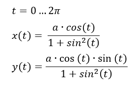
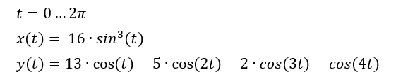
The animation shown above is composed by two curves:
If you want to plot these curves without animating them, the code is extremely easy with ggplot2:
[code lang="r"]
## Import required packages ##
library(ggplot2)
library(dplyr)

## Create data frame with values for both parametric equations ##
heartdf = data_frame(
  t = seq(0, 2*pi, pi/60),
  x = 16*sin(t)^3, #x values for heart curve
  y = 13*cos(t) - 5*cos(2*t) - 2*cos(3*t) - cos(4*t), #y values for heart curve
  x2 = 3*sqrt(2)*cos(t)/(sin(t)^2 + 1), #x values for leminiscate
  y2 = 20 + 4*sqrt(2)*cos(t)*sin(t)/(sin(t)^2 + 1) #y values for lemniscate
  )

## Create plot ##
p = ggplot(data = heartdf, aes(x, y)) +
  geom_path(aes(group = 1)) +
  geom_path(aes(group = 1, x = x2, y= y2), size = 2, colour = "red") +
  geom_polygon(aes(group = 1), fill = "red") +
  geom_text(aes(x = 0, y = 0, label = "Happy Valentine's Day \n Marioly!!!"),
            size = 10, colour = "white")

p
[/code]
If you want animate the plot, you can use gganimate. This package allows you to add an aesthetic component related to a frame (time) variable and it creates the animation by looping through each value of the frame variable and joins the plot with ImageMagick.
Before starting you will need to install gganimate and ImageMagick:
[code lang="r"]
# install gganimate from GitHub
library(devtools)
install_github("dgrtwo/gganimate")

# install ImageMagick
library(installr)
install.ImageMagick()
[/code]
This is the code for the animation:
[code lang="r" highlight="17, 21, 26, 28, 29"]
# Import packages #
library(ggplot2)
library(dplyr)
library(animation)
library(gganimate)

## Create data frame with values for both parametric equations ##
heartdf = data_frame(
 t = seq(0, 2*pi, pi/60),
 x = 16*sin(t)^3,
 y = 13*cos(t) - 5*cos(2*t) - 2*cos(3*t) - cos(4*t),
 x2 = 3*sqrt(2)*cos(t)/(sin(t)^2 + 1),
 y2 = 20 + 4*sqrt(2)*cos(t)*sin(t)/(sin(t)^2 + 1)
)

# Create frame variable for text #
textdf = data_frame(t = max(heartdf$t) + 1:25)

# Create plot #
p = ggplot(data = heartdf,
           aes(x, y, frame = round(t, 1), cumulative = TRUE)) +
 geom_path(aes(group = 1)) +
 geom_path(aes(group = 2, x = x2, y= y2), size = 2, colour = "red") +
 geom_polygon(aes(group = 1), fill = "red") +
 geom_text(aes(x = 0, y = 0, label = "Happy Valentine's Day \n Marioly!!!",
           frame = t), data = textdf, size = 10, colour = "white")

ani.options(interval = 0.06) #animation speed, seconds per frame
gganimate(p, title_frame = FALSE)
[/code]
Notice that is very similar to the code without animation, the only differences are:
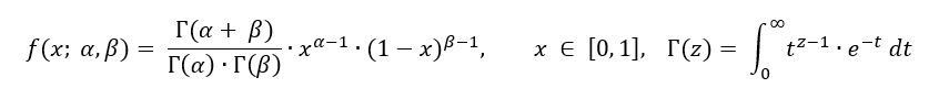
The Beta distribution defined as:
is one of the most flexible distributions since it can take very different shapes depending on the selection of the shape parameters (α and β).
See below:
The code to create the plot above is:
[code lang="r" highlight="28, 37, 38"]
## Import packages ##
library(ggplot2)
library(dplyr)
library(tidyr)
library(purrr)
library(animation)
library(gganimate)

## Function to evaluate Beta pdf for a vector of values ##
calc_beta = function(alpha, beta){
  x = seq(0.01, 0.99, 0.01)
  densityf = dbeta(x, shape = alpha, shape2 = beta)
  return(data_frame(x, densityf))
}

## Create data frame with evaluation of Beta pdf for different combinations of alpha and beta ##
alpha = c(0.1, 0.5, 1:5, 10)
beta = c(0.5, 1, 2, 5)

## Create data frame ##
# Couldn't get the pipe operator to properly show up in WordPress :-(
df = expand.grid(alpha = alpha, beta = beta)
df = group_by(df, alpha, beta)
df = unnest(mutate(df, plotdata = map2(alpha, beta, calc_beta)))

## Create plot ##
p = ggplot(df, aes(x = x, y = densityf, colour = factor(alpha), group = factor(alpha))) +
  geom_path(aes(frame = alpha, cumulative = TRUE), size = 0.5) +
  facet_wrap(~beta,
             labeller = label_bquote(cols = beta == .(beta))) +
  ylim(c(0, 6)) +
  labs(y = expression(paste("f(x; ", alpha, ", ", beta, ")")),
       title = "Changing parameters in Beta density function") +
  scale_colour_discrete(name = expression(alpha)) +
  theme(plot.title = element_text(hjust = 0.5))

ani.options(interval = 0.8)
gganimate(p, title_frame = FALSE, width = 4, height = 4)
[/code]
If you take a close look at the code, you’ll notice that with only 3 lines of code (the ones highlighted) you can create the animation. All other lines of code are required for the static version of the plot.
Important note: Make sure to Run your IDE (RStudio, RTVS, …) as Administrator to create the animations.
Here are a couple scenarios, taken from David’s presentation in PlotCon, where animation might come handy:
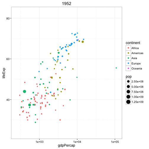
The plot below has 4 dimensions: x (GPD per capita), y (Life expectancy), color (continent), size (population). With an animation, you can add a 5th dimension (time) and see the change through time.
This animation is very similar (conceptually) to the ones created by the late, great Hans Rosling.
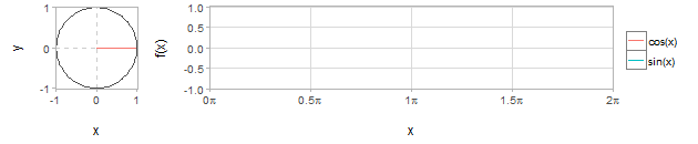
Relationship between trigonometric functions and x and y axis lengths in a unit circle
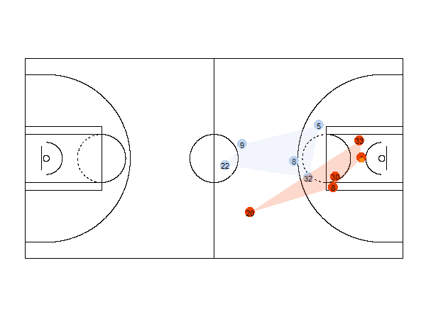
For example, the animation below shows the position of the players of each team and the ball for a basketball game. It also shows the convex hull of the positions of the players.
Well that’s all for now!
For any doubts/requests about the gganimate package, please go to: gganimate questions / gganimate GitHub page
Subscribe to the site to get notified when new posts come up!
Do you want to learn or get better at R programming? If yes, you will…
Go to Master Data Analysis Yes, you read the title of this post correctly, you…
In this post, I’ll show how to create a simple model to predict if a…
Are you wondering what's all this buzz about data science? The following videos will give…
Go to Master Data Analysis This is the 4th post of a series that covers…
Go to Master Data Analysis This is the 5th post of a series that covers…